


“Diamonds on velvets on goldens on Vixen, on Comet and Cupid, on Donner and Blitzen, on up and away and afar and a go-go, escape from the weight of your corporate logo.” From Absolutely Free, written by Frank Zappa
 One of the many things I’ve enjoyed in my career has been working with letterers, calligraphers, and designers. It’s artistic, it’s creative, and it’s a lot of fun. Having taken design at the prestigious School of the Art Institute of Chicago, I can fake knowing their language.
I had the privilege of working with a great many such artists, dating all the way back to my hippie days at the Chicago Seed watching the brilliant Lester Dore turn words into emotion-provoking art.
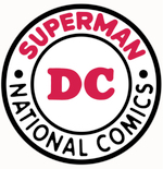 I first got to DC Comics back in 1976. They had just changed their name to “DC Comics”, and they decided to hire award-winning designer Milton Glaser to come up with their new corporate logo. It was their first in quite a while. When Batman started outselling Superman, there was talk n about changing the “Superman” part of the Superman/DC/National Comics bullet, or so I’m told. Instead, they decided on nothing and simply let the letters “DC” stand undressed for trade. Jenette Kahn hired Glaser to change all that.
Most Americans who care anything about design will tell you Milton was a genius. I agree, but quite frankly I didn’t care for some of his work. His use of “inlines” at New York Magazine, Psychology Today, and at the Grand Union supermarket chain (et al) was more than just his trademark; it was his raison de vivre. It made much of his work look the same, aside from his famous Bob Dylan poster and his “I Love New York” bit of business.

For me, his new logo posted a challenge. Back then I wrote and designed DC’s house ads, which meant the Glazer logo had to be readable at a very small size. Worse still, back in those days we were printed on recycled toilet paper using printing plates made of Silly Putty. Fine lines, and that includes inlines, often looked like they had St. Vitus’ Dance. The late great Len Wein named them “boogy lines.”
 That lasted from 1976 until 2005, which is a healthy run. It was changed to the DC Swirl, which looked a lot more dynamic. That logo would “pop” off the rack, which is its primary job. That one lasted seven years. New management replaced it with arguably the single worst corporate logo in comics history… up to October 2024. Four years later more reasonable heads prevailed and the DC bullet changed to the one used until this month.
Then came “right now.” Warner Bros. Discovery, owners of DC and the newly branded DC Studios and half of all media not yet owned by Disney brought back the Glaser logo. OK, a lot of people grew up with that design, and they have strong feelings for it and that’s swell, but my problem now with the Glaser logo is not its design. A new logo should entice readers by adding an ambiance of energy and originality. The Glaser logo suggests a lot of things… all from the 20th century. It is nothing new.
 Several paragraphs above, I wrote “the single worst corporate logo in comics history… up to October 2024.” I was not referring to the revived Glaser logo.
I was referring to a logo so bad, so dull, so immature that it makes manual typewriters look like quantum typesetters. It was introduced right before the New York Comic-Con, and it came down from our friends at IDW.
 I really don’t know the new management at IDW, and they are a major comic book publisher. But their brand-new logo sucks. It does not brand the product in a positive, exciting manner. It is not supposed to be unreadable. Or boring. Or stupid.
Very few comics’ corporate logos are noteworthy. Publishers really didn’t want to be noticed as a brand; indeed, during much of the past comics were perceived negatively by the intelligentsia and the politically desperate. They should not stand on the racks screaming at the potential reader about their own lameness.
However, if you look closely you might find the likeness of 17 U.S. presidents imbedded in the new IDW design. Try it with 3-D glasses.
